There’s a little dopamine rush. Not the kind of big hit that leaves your breathless after eating a slice of gooey Neapolitan pizza when you’re dying of hunger, but a little, teensy one — like a sparkler going off in your hypothalamus. It happens after you hit the ‘like’ button on Instagram or Facebook. A little animation plays. A tap of the finger, little hearts float upward, then — dopamine. Nearly imperceptible, but if you close your eyes and focus, you can feel it. It feels like a tiny flutter of excitement.
This hit of brain chemicals is no mistake. The good people at Facebook and Instagram, and on all the other design teams for all the other apps — have engineered it so. Actions and micro-interactions. Little moments of delight.
Often, when we talk of software, we fetishize big ideas. Will Slack change the way we do business? How many features does it have? Is it sleek?
Features. Platforms. Paradigms. Technologies. Is this the right design pattern? Are the features discoverable? Are the swipe gestures intuitive? We talk about these things incessantly. Good software does not happen by accident.
Swipe a message, push a button. There are interactions: big and bold and ordinary. Interactions make things happen.
But what of the humble micro-interaction? The near-invisible details that imbue static pixels with life? They are granular and tiny; small animations and kinetic patterns; but they can make design shine. They have great power: They can delight and inform, build trust, engage. But they can also violate, they can bloat, distract, misdirect, and confuse.
The epigraph rings true: The power of the sword lies not with the sword, but with he who wields it.
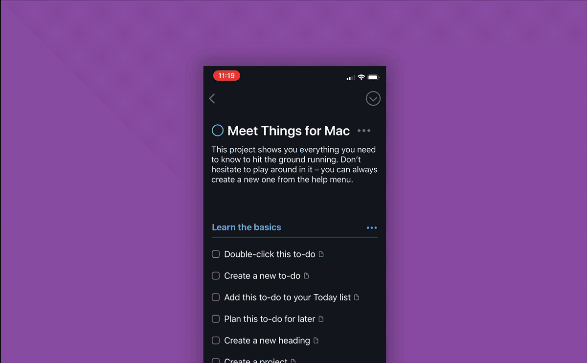
Things 2.0, the wonderful todo list app by Cultured Code (now in its second iteration) is one of my favourite apps. It is micro-perfection incarnate: little animations — sometimes expected, sometimes unexpected, move us around the interface, providing feedback where we need it, and speak to us almost as if by telepathy. When I swipe upwards in the app on my iPhone, a little search icon animates into view. It tells me to expect a search function and — Voila! — a search field snaps into view. The movement is elastic. If I don’t swipe far enough, it rebounds. No search field — but the icon saves me. It rotates, like a progress bar, and shows me that I need to swipe just a little further. It is wonderful.
Well-designed micro-interactions are a sign that a designer (or product manager, founder, developer etc etc) cares about their users. But too many micro-interactions can be a sign that a designer (or product manager, founder, developer) is being self-indulgent. Over-indulgence in design can backfire. Too many micro-interactions make a needy app, and a needy app demands more of its users than it gives.
Navigation apps are some of the worst offenders. Google has loaded its maps to the gills, flashing and pulsing and spinning objects abound, panels fly in and out. Waze is stacked so heavily with micro-interactions that you can almost feel the app sluggishly struggling to obey your commands under their weight.
This is the cost of adding such extraneous kinetic detail: animations create bloat, and bloat creates slowness. Bloat is the entropy that consumes all software. A slow app is a bad app, no matter how good its intentions are. After all, an app is simply a tool, and a tool that cannot perform its function in a timely manner is a poor tool. Fast tools have a snap to them, a certain verve. They respond to our very thoughts like they are extensions of us. They evoke simplicity and elegance. A simple, elegant tool is a delightful tool. It is a tool that we can grow to love, and a lovely tool is one of life’s great pleasures.
When we design apps, it can be tempting to hyper-focus. To keep adding details. But how much is too much? What is the right balance? Just enough. Subtlety is key. We don’t want to smash users over the heads with needy UI that wiggles and flashes and animates whenever things happen, rather, we want to caress them gently with the lightest of touches, to guide them only when they require guidance. So we offer these moments of interactive delight only when they are needed, and only when they are useful.
But when micro-interactions are engineered sparingly, when they are layered elegantly overtop of good bones, they are so very powerful. They can direct our attention, they can teach us, they can give us feedback, they can draw us in and, best of all — they can create little moments joy, of wonderment. They become the heartbeats of our software.